Display custom emoji icons and styles on inline and reply keyboard buttons (Bot API 9.4) - #1091
Open
sehamilton0805 wants to merge 5 commits into
Open
Display custom emoji icons and styles on inline and reply keyboard buttons (Bot API 9.4)#1091sehamilton0805 wants to merge 5 commits into
sehamilton0805 wants to merge 5 commits into
Conversation


Renders InlineKeyboardButton.iconCustomEmojiId before the button text
and maps ButtonStyle primary/success/danger to textNeutral/iconPositive/
textNegative theme colors (Bot API 9.4).

Co-Authored-By: Claude Fable 5 <noreply@anthropic.com>
Same Bot API 9.4 fields for reply keyboards: CommandKeyboardLayout
buttons become CustomEmojiTextView with a CustomEmojiId span for
iconCustomEmojiId, and ButtonStyle drives the per-button text color.

Co-Authored-By: Claude Fable 5 <noreply@anthropic.com>
Icon width made tight labels wrap at arbitrary characters. Force
greedy break strategy without hyphenation and cap at 2 lines with
end ellipsis, matching inline keyboard behavior.

Co-Authored-By: Claude Fable 5 <noreply@anthropic.com>
The icon footprint narrows the EmojiString layout, so labels that
previously fit exactly were char-broken by StaticLayout. Shrink the
font (14..10dp) until the widest word fits the reduced width; measure
the default step at 15dp matching the actual getBoldPaint14 size.

Co-Authored-By: Claude Fable 5 <noreply@anthropic.com>
Auto-size cannot prevent mid-word breaks (a split-word layout still
satisfies its constraints); shrink the font until the widest word and
a 2-line label fit instead, refitting when keyboards are swapped.

Co-Authored-By: Claude Fable 5 <noreply@anthropic.com>
Author
|
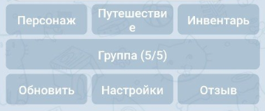
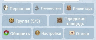
Before / after screenshots, taken with a bot that sets Before (current
After (this PR) — custom emoji icons are rendered before the label, and the button font is fitted to the widest word, so icons never cause mid-word breaks (tight labels shrink slightly instead):
|
This file contains hidden or bidirectional Unicode text that may be interpreted or compiled differently than what appears below. To review, open the file in an editor that reveals hidden Unicode characters.
Learn more about bidirectional Unicode characters
Sign up for free
to join this conversation on GitHub.
Already have an account?
Sign in to comment
1 participant

Add this suggestion to a batch that can be applied as a single commit.This suggestion is invalid because no changes were made to the code.Suggestions cannot be applied while the pull request is closed.Suggestions cannot be applied while viewing a subset of changes.Only one suggestion per line can be applied in a batch.Add this suggestion to a batch that can be applied as a single commit.Applying suggestions on deleted lines is not supported.You must change the existing code in this line in order to create a valid suggestion.Outdated suggestions cannot be applied.This suggestion has been applied or marked resolved.Suggestions cannot be applied from pending reviews.Suggestions cannot be applied on multi-line comments.Suggestions cannot be applied while the pull request is queued to merge.Suggestion cannot be applied right now. Please check back later.
Bot API 9.4 (February 2026) added two per-button fields that official clients already render, while Telegram X currently ignores them:
iconCustomEmojiId(a custom emoji shown before the button text) andstyle(primary / success / danger accent). The bundled TDLib already exposes both onTdApi.InlineKeyboardButtonandTdApi.KeyboardButton, so this PR is rendering-only — no TDLib or layer changes.What it does
Commit 1 — inline keyboards (
TGInlineKeyboard,TGMessage,MessageView):iconCustomEmojiIdis rendered before the button text via a single-emojiText(the sameFormattedText("*") + TextEntityTypeCustomEmojipattern asEmojiStatusHelper), so animated/static emoji, thumbnails and premium repainting all reuse the existing machinery. Media lives in a new dedicated lazily-createdComplexReceiveronMessageView(modeled afterfooterTextMediaReceiver), attached/detached/destroyed with the view; requests are wired throughrequestAllTextMedia, invalidation throughperformWithViewslikehAuthorEmojiStatus. Text width is reduced by the icon footprint during measure; the icon+text group stays centered, RTL mirrored.stylemaps onto the existing per-button color override path (customColorId) using the app's canonical semantic colors (OptionsLayout.getOptionColorIdprecedent): primary →textNeutral, success →iconPositive(same as the giveaway "participating" button), danger →textNegative. In plain mode it colors outline + text + ripple + progress + corner type icons; in bubble mode the text is tinted while the standard translucent fill is kept.buildLayoutremoved only every other extra button (remove(i)while iterating forward); replaced with a correct shrink that also releases per-button resources.Commit 2 — reply (bot) keyboards (
CommandKeyboardLayout,MessagesController):CustomEmojiTextView(existing widget); the icon is aCustomEmojiIdspan over a placeholder char prepended to the label —EmojiFilterdoes the rest.styledrives the per-button text color, re-registered on every bind viaaddOrUpdateThemeTextColorListenersince views are recycled between keyboards.performDestroy(); the controller-level teardown happens only in thedestroyInstance || !reuseEnabledbranch (same pattern asemojiLayout), keeping the reuse-enabled cached controller intact.Testing
mainand:app:compileLatestUniversalDebugJavaWithJavacpasses clean.